Best Practices for eForms
The purpose of this document is to outline and explain advanced functionality of Therefore™ eForms. Click on each of the different topics below to expand and read different cases for each advanced feature.
 Advanced Logic
Limit Select Box Component to Only One Check
The Select Boxes Component can be found under Basic Components. Navigate to the Validation tab.
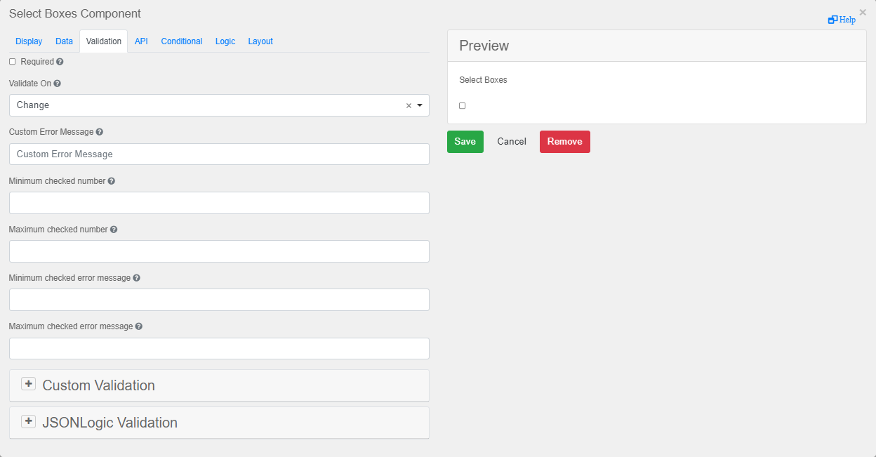
Here, you can use the built-in feature to define the number of boxes that can be selected by entering a Minimum checked number and/or a Maximum checked number of boxes that need to be checked before the form can be submitted.
It is possible to configure the Select Boxes Component to automatically de-select a previously selected box when the user selects a new one. To do so, use the Logic tab. In this tab, configure as many different logic triggers as there are select boxes.
-
The first step is to store a "changed" state of the component. The following logic will be used to configure the first check-box, and will be called by the triggers corresponding to the rest of the check-boxes:
CopyFirst checkboxconst current = data.selectBoxes2;
const previous = instance._previousSelectBoxes;
instance._changed = Object.keys(current).find(
key => current[key] !== (previous?.[key] ?? false)
);
result = instance._changed === 'test' && data.selectBoxes2.test; -
For the remaining logic triggers, except the last, use the following logic:
-
Copy
Second to Second-to-last checkboxes
const current = data.selectBoxes2;
const previous = instance._previousSelectBoxes;

result = instance._changed === 'test2' && data.selectBoxes2.test2; -
For the logic trigger corresponding to the last check-box, use the following logic:
CopyLast checkbox
const current = data.selectBoxes2;
const previous = instance._previousSelectBoxes;

instance._previousSelectBoxes = { ...data.selectBoxes2 };

result = instance._changed === 'test3' && data.selectBoxes2.test3;

|
Note: The terms "test", "test2" and "test3" should correspond to the value (not the label) of the check-box being configured. |
Every logic trigger for each check-box is able to save the current state as the "previous" state, allowing it to be continuously updated as the user changes which box has been selected. By doing so, only one check-box at a time may be selected.
Note that this is a fully customizable project, thus the variable names and code structure can all be changed to better suit your needs.
Set Value
In this scenario, the user wants to set a hidden number component to 0 or 1, depending on whether a checkbox is checked or not. The change should only happen if the previous value is changed. Since the previous value is not typically available for this logic, you can save it to a hidden component called “hiddenSavedValue”, which can be added to the form. When the value in “hiddenSavedValue” differs from the current value, this indicates that it was changed. This triggers the script to update the dependent number value.
A Number Component can be added under Basic Components.
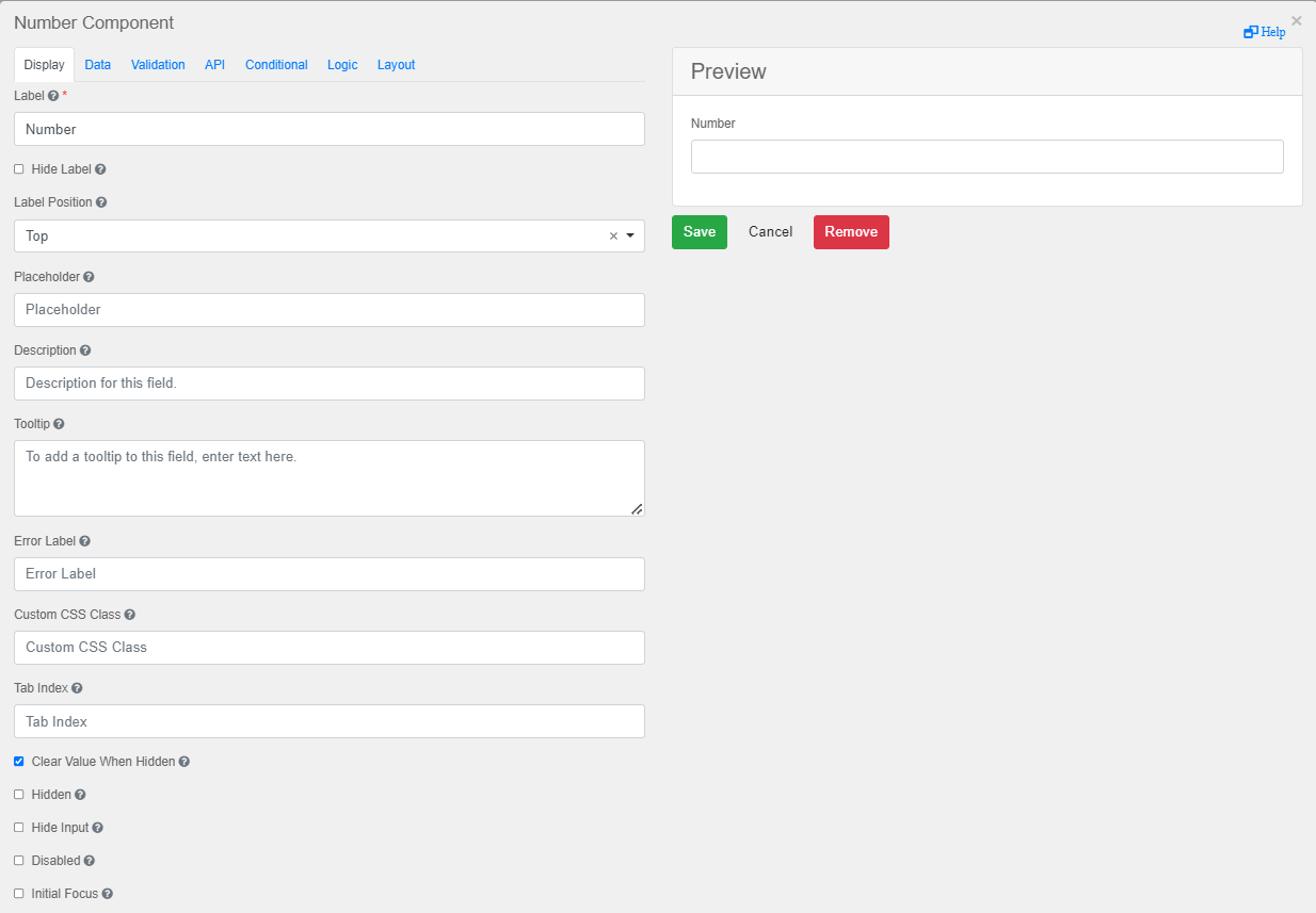
Navigate to the Logic tab and add the script.
if (data.checkbox2 !== undefined && data.checkbox2 !== data.hiddenSavedValue)
{
    result = true;
    data.hiddenSavedValue = data.checkbox2;
}
else
{
    result = false;
}
Next, set a value to a field triggered by a checkbox.
Logic with Hidden Component
This logic will reset the value of a Select Component based on a trigger (checkbox).
Add a Select component. It can be found under Basic Components.
Navigate to the Logic tab.
In this scenario, the customer wants to clear a Select Component field in case a different dependent field is cleared again and had a value previously. This follows the same concept as the previous section.
Keep the old value in a hidden component, and if this changes, update the dependent components
if (data.selectA !== undefined && data.selectA !== data.hidden)
{
    result = true;
}
else
{
    result = false;
}
data.hidden=data.selectA;Button to Trigger Logic
This is the recommended method to trigger a logic from a button.
|
|
Note: There is no method to force the UI to see that a button has been activated/clicked. This means that an automated action cannot be triggered from the button reaction. |
Navigate to the Display tab of the Button Component and select Event from the dropdown menu under Action. Under Button Event, enter SetText.
Next, navigate to the Logic tab and define the Action associated with the SetText button event. To do so, select Event from the dropdown menu under Type and enter SetText as the Event Name. To proceed to the next step, click Add Action.
Enter an Action Name for your Action and select Value from the dropdown menu under Type. Define the value using a script as shown in examples above. Click Save Action to conclude.
Calendar
Date is a Week Date
To check if a selected day is a weekday or to limit the choice of date based on weekday the script below can be used as a form of Custom Validation.
var isWeekday = ((input.getDay() !== 0) && (input.getDay() !== 6));
valid = isWeekday ? true : false;
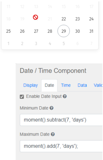
Restrict Date
To restrict calendar availability in the Date/Time Component the following of code can be utilized.
CSS
Field CSS
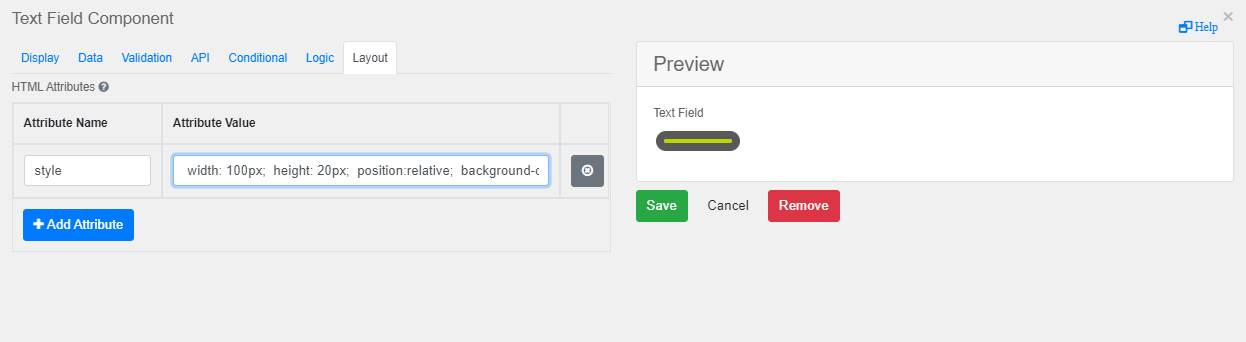
Some eForm components support CSS directly in the Layout tab.
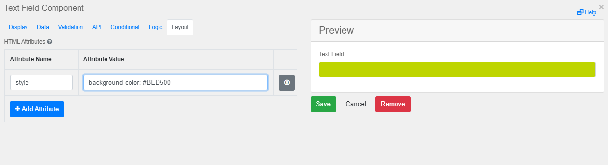
Below is a non-exhaustive list of fields that support (or don't support) CSS:
| CSS Suported | CSS Not Supported |
|---|---|
|
Text field |
Date |
| Table Lookup | Text Area |
| Currency | |
| Number | |
| Password | |
| Phone Number | |
| Address field |
Below is a non-exhaustive list of CSS supported in the Layout tab:
width: 100px;
height: 20px;
position:relative;
background-color: #BED500;
border-style: solid;
border-width: 10px;
border-color: #595959;
color: white;
padding: 2px 2px;
text-decoration: line-through;
vertical-align: center;
display: block;
font-size: 16px;
margin: 4px 4px;
cursor: pointer;
border-radius: 24px;
background-size: 60%
background-repeat: no-repeat;
background-position: 50% 10%;
Full CSS
To get full CSS inside any eForm you need to use an HTML Element component with a style bracket under Content. The HTML Element component can be found under Advanced.
Example:
<!DOCTYPE html>
<html>
    <head>
        <style>
            .disclaimer{
                color:red; text-align:center;
            }
        </style>
    </head>
</html>
Custom CSS Class
To get the same CSS on multiple components, use the custom CSS feature.
Example:
<!DOCTYPE html>
<html>
    <head>
        <style>
            .sample-class
            {
            font-family: "Comic Sans MS", cursive, sans-serif;
            font-size: 25px;
            letter-spacing: 2px;
            word-spacing: 2px;
            color: #000000;
            font-weight: normal;
            text-decoration: none;
            font-style: normal;
            font-variant: normal;
            text-transform: none;
            }
        </style>
    </head>
</html>
To use your custom CSS class, enter the name of the class in the Custom CSS class field of a component.
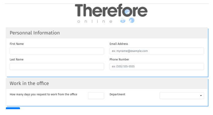
Panel CSS
Some CSS will affect existing components, not exclusively HTML components.
.panel{
    box-shadow:5px 5px 0px 0px #a6cff5;
    }
.panel-heading{
    background-color:#f0f0f0;
    color:#595959;
    }
.panel-title{
    font-size: 170%;
    }
skip screenshot 24
This code will create :
-
A shadow around 2 sides of all "panels" in the eForm (5px)
-
A title section with a gray background.
-
Panel title with larger font (170%)
Advanced CSS
An eForm that needs advanced visual design or advanced dynamic reactions can be updated using a full CSS setup.
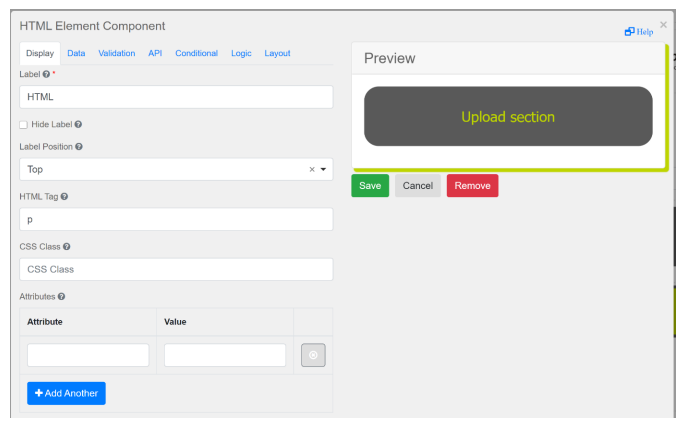
An HTML component can support full CSS:
<!DOCTYPE html>
<html>
<head>
    <style>
        .panel{
            box-shadow: 5px 5px 1px 1px #BED500;
        }
        .square-button{
            width: 100%;
            height: auto;
            position: relative;
            background-color: #BED500;
            border-style: solid;
            border-width: 5px;
            border-color: #595959;
            color: white;
            padding: 2px 2px;
            text-decoration: none;
            vertical-align: center;
            display: block;
            font-size: 16px;
            margin: 4px 4px;
            cursor: pointer;
            border-radius: 24px;
            background-size: 60%;
            background-repeat: no-repeat;
            background-position: 50% 10%;
        }
        .button2-secondary: hover{
            background-color: #595959;
            border-color: #595959;
        }
        .button-text{
            position: relative;
            bottom: 1%;
            width: 100%;
        }
        .title1{
            text-align: center;
            border-style: solid;
            border-color: #595959;
            border-radius: 24px;
            background-color: #595959;
            color: #BED500;
            font-family: "Tahoma", serif;
            border-width: 5px;
            padding: 30px;
        }
        .title2{
            border-style: solid;
            border-color: #595959;
            border-radius: 12px;
            background-color: ;
            color: #BED500;
            font-family: "Tahoma", serif;
            border-width: 5px;
            padding: 10px;
        }
    </style>
</head>
<body>
    <h4 class="title3"> Upload section </h4>
</body>
</html>
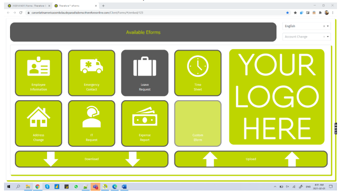
This setup will create:
-
Two types of titles
-
A shadow over the panel
-
One type of button
-
One mouse-over effect on button
This allows you to make visual changes in the same way as any website using CSS. You can now create an eForm as the one pictured below:
Scripting for Dynamic Color Changing
The following script can be added in the Conditional tab of any component to trigger a dynamic change.
if (data.textField === 'aaa')
{instance.element.style.backgroundColor = 'red'

if (data.textField === 'aaa')
{instance.root.components[0].element.style.backgroundColor = 'green'}

Color-Changing Background Using CSS
CSS animations can be used to make an eForm in which the background changes color.
<!DOCTYPE html>
<html>
    <head>
        <style>
            body {
                animation: colorchange 5s infinite;
            }
            @keyframes colorchange {
                0% {background: #f0f0f0;}
                50% {background: #595959;}
                100% {background: #f0f0f0;}
            }
        </style>
    </head>
</html>Layout
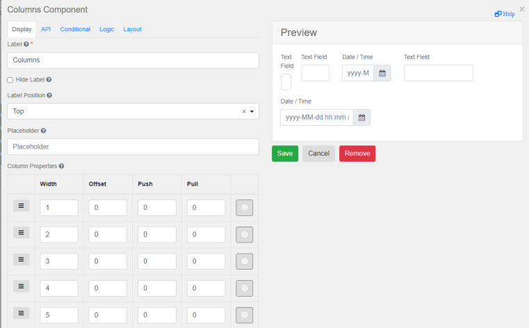
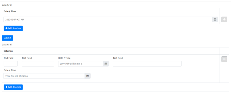
When using a Data Grid or an Edit Grid, you can incorporate a Column or a Panel component to add multiple fields with different positions in your grid.
Sum & Calculations
To do any calculations inside a grid, you can use the row. option.
Example formula for row price sum:
value = row.quantity4 * row.unitPrice4;quantity4 = API Name of column with quantity
unitPrice4 = API Name of column with unit price
value = data.editGrid2.reduce((a, b) => a + (b['totalPrice4'] || 0), 0);editGrid2 = API Name of Edit Grid Component
totalPrice4 = API Name of column to sum up
Save Collapse
If you need to hide the contents of a grid when the eForm is produced as a PDF, check the checkbox 'Collapse grid when saving as PDF' in the 'Templates' tab of a grid component.
Hide Column in Grid Render for End User
In this scenario, an expense report is being filled out. The user needs to input a lot of information when filling out the form, but the final table result should contain only the key value.
The user needs to enter data for all these fields: Date, Type, Description, Currency, Other Currency, Exchange Rate, Amount, Tax, etc… However, the final table result should display only Date, Type, Description and Amount.
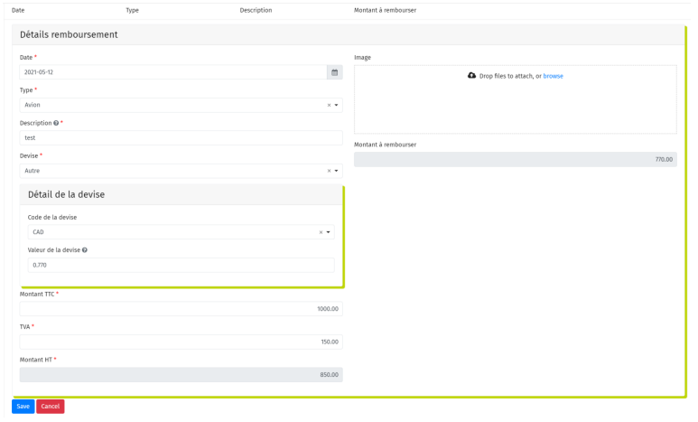
If you need a column to appear when the end user is creating a row, but not appear in the final result, you can do the following:
In your Grid component, in the Template tab, modify both the headers and the row.
In this example, the table contains multiple columns that need to be hidden in the user interface when rows are added.
All of the components that have API in yellow below would be hidden. Only the components that are not listed will be shown in the result table.
The Headers (the required part of the sample below is between lines 4 to 11 and 13 to 20)
<div class="row">
{% util.eachComponent(components, function(component) { %}
{% if (!component.hasOwnProperty('tableView') || component.tableView) { %}
{% if (component.key !== 'select') { %}
{% if (component.key !== 'devise') { %}
{% if (component.key !== 'A4') { %}
{% if (component.key !== 'A3') { %}
{% if (component.key !== 'A') { %}
{% if (component.key !== 'upload2') { %}
{% if (component.key !== 'monnaie2') { %}
{% if (component.key !== 'B') { %}
<div class="col-sm-2">{{ component.label }}</div>
{% } %}
{% } %}
{% } %}
{% } %}
{% } %}
{% } %}
{% } %}
{% } %}
{% } %}
{% }) %}
</div>
The Row (the required part of the sample below is between lines 3 to 10 and 14 to 21)
<div class="row">
{%util.eachComponent(components, function(component) { %}
{% if (component.key !== 'select') { %}
{% if (component.key !== 'devise') { %}
{% if (component.key !== 'A4') { %}
{% if (component.key !== 'A3') { %}
{% if (component.key !== 'A') { %}
{% if (component.key !== 'upload2') { %}
{% if (component.key !== 'monnaie2') { %}
{% if (component.key !== 'B') { %}
<div class="col-sm-2">
{{ row[component.key] }}
</div>
{% } %}
{% } %}
{% } %}
{% } %}
{% } %}
{% } %}
{% } %}
{% } %}
{% }) %}
<div class="col-sm-2">
<div class="btn-group pull-right">
<div class="btn btn-default btn-sm editRow"><i class="fa fa-edit"></i></div>
<div class="btn btn-danger btn-sm removeRow"><i class="fa fa-trash"></i></div>
</div>
</div>
</div>
This must be done for all columns you want to hide.
Image
Change HTML According to Trigger
Use the script below to change an image in reaction to a trigger. This script needs to be in the Calculation tab of the HTML component.
In the example below, the trigger is a Select component with api = select and option 1 and 2.
if (data.select === '1') {
instance.htmlElement.innerHTML = "<img
src='https://storage.googleapis.com/therefore_hr/Canon-Therefore.jpg' width=50%
height=50%>";
}
else if (data.select === '2') {
instance.htmlElement.innerHTML = "<img
src='https://storage.googleapis.com/therefore_hr/therefore%20logo.png' width=50%
height=50%>";
}
Important here is that a loop should always contain either a manual or a wait task to prevent countless executions in a very short time frame.
Example:
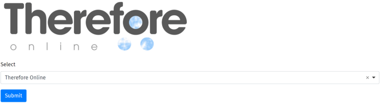
If you select Therefore™ Online from the option below, the Therefore™ Online logo is shown. Otherwise, the regular Therefore™ logo is shown.
Base 64
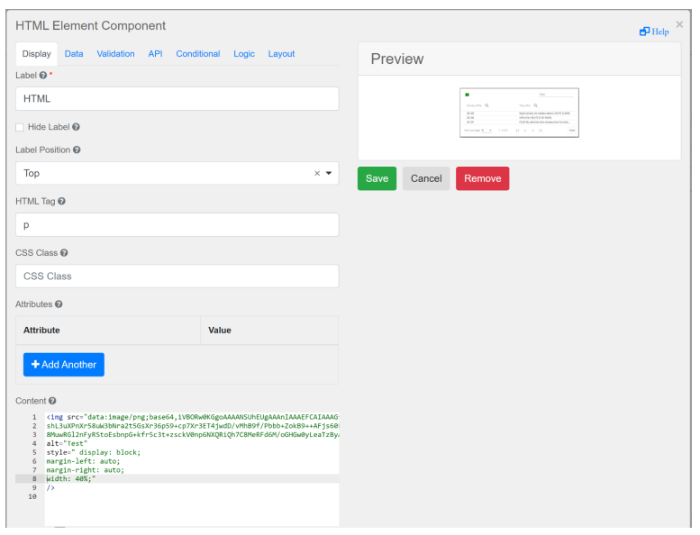
You can convert any image to a base 64 line using a website such as https://www.base64-image.de/
Use this code in the HTML component:
<img src="data:image/png;base64,<base64 encoded image data>"
alt="Test" style=" display: block; margin-left: auto; margin-right:
auto; width: 40%;"
/>
Page Break
In a PDF
When an eForm is submitted, a PDF version of the form is created in Therefore™. Use “pagebreak-here’’ in the appropriate field to manually set where the page break should occur.
This needs to be added to the component that should be before the page break, in the 'Custom CSS Class' field.
Optimizing page breaks in a PDF
Page breaks can be customized using the HTML Element eform component. Use defined dedicated classes to specify where page breaks should be located. Please click the following link to find more information about CSS rules:
https://www.w3schools.com/cssref/pr_print_pageba.asp
It is also possible to protect some elements in order to prevent page breaks using CSS:
@media print {
        div {
            page-break-inside: avoid;
        }
    }
More information about preventing page breaks can be found here:
https://www.codesdope.com/blog/article/css-page-break-inside/
An example of setting page breaks using the HTML element component is demonstrated in the following code sample
<!DOCTYPE html>
<html>
    <head>
        <style>
            div > p.the-page-break-before {
                break-before: always;
                page-break-before: always;
                /*background: green;*/
            }
            div > p.the-page-break-before {
                break-before: always;
                page-break-before: always;
                /*background: yellow;*/
            }
            /*ul.editgrid-listgroup li:nth-child(2n),*/
            ul.editgrid-listgroup div.divpagebreak-here:nth-child(2n) {
                break-after: always;
                page-break-after: always;
                /*background: #bed%00;*/
            }

            @page {
                padding-top: 25px;
                margin-top: 25px;
            }
        </style>
    </head>
</html>|
|
Note: It is easier to develop style-sheet rules if the structure displayed in the browser is the same as the one of the PDF. |
In HTML
This script will create a page break in an HTML component.
</p>
   <div>
      <div class="pagebreak-here"></div>
      <div class="DIV1">…</div>
  </div>
</p>
PDF Customization
In a Therefore™ On-Premises installation, PDF customization can be configured on the server level. This means that the set customization is applied to all PDFs that are created from an eForm submission on this server. This method can be used to set branding colors or formatting server-wide.
The files that have to be edited in order to customize PDFs can be found in the following folder:
$SERVER\Program Files\Therefore\FormConvert\First, custom.css must be enabled in the file titled 'Convert.Form.html'. The file contains information about which line should be uncommented in order to enable custom.css.
<!DOCTYPE html>
<html lang="en">
<html>

<head>
    <link rel='stylesheet' href='./shared/formio.full.min.css'>
    <link rel='stylesheet' href='./shared/bootstrap.min.css'>
    <link rel='stylesheet' href='./shared/the.css'>
    <!-- uncomment next line to enable custom.css -->
    <!-- <link rel='stylesheet' href='./custom.css'> -->
    <script src='./scripts/formio.full.min.js'></script>
    <script src='./scripts/the.js'></script>
    <title>eForm Conversion</title>
</head>

<body>
    <div id='formio'></div>
    <div id='json-holder"></div>
</body>

</html>
Now, basic or complex rules for PDF customization can be specified in the file 'custom.css'.
|
|
Custom CSS for specific eForms Custom CSS can also be defined for specific eForms. To do so, define the rules in the 'Custom CSS' field of an HTML element and call it from the 'Custom CSS' field of other eForm components. This solution works both on Therefore™ On-Premises and Therefore™ Online. |
Hide in PDF
It is possible to hide components in the PDF rendering of an eForm. To do so, open the eForm in Edit mode, click 'Edit' for the component that should be hidden and enter 'hide-in-pdf' under 'Custom CSS Class'. This will always hide the component.
To hide a component under certain conditions, edit the component, go to the 'Data' tab, and enter the following Java script in the 'Calculated Value' field. Instead of 'true', use the value that should cause the field to be hidden.
value = data[component.key];
if (value === 'true') {
instance.element.classList.add('hide-in-pdf');
} else {
instance.element.classList.remove('hide-in-pdf');
}
It is also possible to hide different components by entering the following script under 'Calculated Value'. This script will hide the component 'SensitiveInformation' if its value is 'true'.
value = data[component.key];
let componentToHide = instance.root.components.find(c => c.key ===
'SensitiveInformation');
if (value === 'true') {
componentToHide.element.classList.add('hide-in-pdf');
} else {
componentToHide.element.classList.remove('hide-in-pdf');
}
Instead of adding a script under 'Calculated Value” for multiple components a helper component can be added. For example, use a Text Component and set it to hidden. Add a 'Custom Default Value' in which it is possible to check multiple components and hide them.
Do Not Save PDF
Use the following method if you want the index data of an eForm to be created/saved in Therefore™, but not the PDF file. In the Therefore™ Solution Designer, navigate to the eForm's Indexing Profile dialog to add a script.
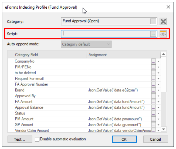
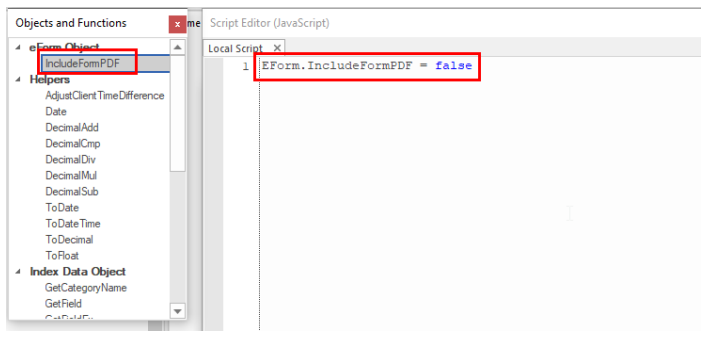
EForm.IncludeFormPDF = falsePDF Page Width
It is possible to set the PDF page size and orientation on the eform level. Each and every eForm can have a different size and orientation.
This can be accomplished via the HTML Element component on the eform itself. In this component users must ensure the custom CSS script they entered sets the eForm (#formio) to the custom page size. The following examples will output a page with the size set to A3 in a landscape orientation, and below it in a portrait orientation.
A3 Landscape
<style>
  @page {
                size: A3 landscape;
  }

  @media print {
    body > #formio {
      width: 1547px; /* calculation: page size - form padding (5mm => ~40px (at 96
DPI))*/
    }
  }
</style>A3 Portrait
<style>
  @page {
                size: A3 portrait;
  }

  @media print {
    body > #formio {
      width: 1083px; /* calculation: page size - form padding (5mm => ~40px (at 96
DPI))*/
    }
  }
</style>
The @page CSS at-rule is used to modify some CSS properties when printing a document. When the PDF is generated, this page width will be also be applied. More info can be found under the link below:
https://developer.mozilla.org/en-US/docs/Web/CSS/@page
The PDF can even have a custom width and height as demonstrated in the following example:
@page {
  size: 4in 6in landscape;
}Basic
A URL such as the one below will pre-populate an eForm when accessed via link.
https://<server>/eForms/#/embed/10?apiKey1=Test&apiKey2=Test2
If the data is coming from your Therefore™ category, use the structure shown below to use category field macros.
apiKey1=[Field1]&apiKey2=[Field2]Advanced
Below is a complex example of a URL to prefill a Therefore™ eForm:
https://sampletenant.thereforeonline.com/eForms/#/embed/23/?
allowanonymous=1&postaction=close&invoiceDate=[InvoiceDate]
&providerName=[VendorName]
&invoiceNumbe=[InvoiceNumber]&grossAmo=[GrossAmount]&uniqueNumber=[DocumentId]
&triggerJustificationLevel1=1
The URL is broken down as follows:
| URL Element | Description |
|---|---|
| https:// | Fixed |
| sampletenant | Tenant Name |
| .thereforeonline.com/eForms/#/embed/ | Fixed |
| 23/ | Eform Number |
| ?allowanonymous=1 | Authorized public user |
| &postaction=close | Close web browser tab after submission |
| &invoiceDate=[Invoice Date] | Populate field api XXX with Macro [XXX] |
| &providerName=[Vendor Name] | Populate field api XXX with Macro [XXX] |
| &invoiceNumbe=[Invoice Number] | Populate field api XXX with Macro [XXX] |
| &grossAmo=[Gross Amount] | Populate field api XXX with Macro [XXX] |
| &uniqueNumber=[Document ID] | Populate field api XXX with Macro [XXX] |
| &triggerJustificationLevel1=1 | Populate field api XXX with Macro [XXX] |
Error Handling
In some cases, there may be issues using characters that cannot exist in a URL without changing the URL function. For example, the ampersand character (&) cannot be used; if you have a text with character (e.g. Vendor Name “AT&T”), it will only show “AT” and there may be other issues with the eForm.
In this case, you must create a hidden data containing the replacement of this Vendor Name.
The code to replace “&” in a URL is %26. The following code will simply take “AT&T” and convert it to “AT%26T”. This can then be used in the URL.
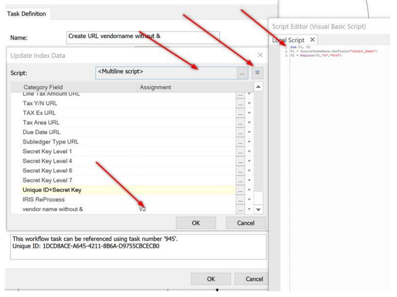
dim V1, V2
V1 = SourceIndexData.GetField("Vendor_Name")
V2 = Replace(V1,"&","%26")
Escaping Special Characters
The following script will correct all URL special characters at the same time.
function convert_text($text) {
$t = $text;
$specChars = array(
' ' => '%20', '!' => '%21', '"' => '%22',
'#' => '%23', '$' => '%24', '%' => '%25',
'&' => '%26', '\'' => '%27', '(' => '%28',
')' => '%29', '*' => '%2A', '+' => '%2B',
',' => '%2C', '-' => '%2D', '.' => '%2E',
'/' => '%2F', ':' => '%3A', ';' => '%3B',
'<' => '%3C', '=' => '%3D', '>' => '%3E',
'?' => '%3F', '@' => '%40', '[' => '%5B',
'\\' => '%5C', ']' => '%5D', '^' => '%5E',
'_' => '%5F', '`' => '%60', '{' => '%7B',
'|' => '%7C', '}' => '%7D', '~' => '%7E',
);
foreach ($specChars as $k => $v) {
$t = str_replace($k, $v, $t);
}
return $t;
}Call Webservice from eForm
This script avoids two scenarios:
-
Submitting an eForm before the REST call answer is returned.
-
Keeping the REST call answer in a Hidden field to avoid an unnecessary REST call.
Add a 'Hidden' component to the eForm. This component is mandatory for the script to work properly.
In the API tab of the component dialog, define the property name and use the script below:
debugger; optional – debug the code in the browser console debugger
var jsonData = data.hiddenTest; check if the data is loaded already / do not
call the Web Service
every time
var htmlObj = document.getElementById('html_contain');
var url = 'https://mdn.github.io/learning
area/javascript/oojs/json/superheroes.json'; url for GET
call
if(data.callWebService === true && jsonData === undefined){ only load again if
not loaded yet
fetch(url).then((response) => { Web Service call
if(response.ok){
return response.json();
}else{
htmlObj.innerHTML = 'something wrong';
//throw new Error('Something went wrong');
}
}).then((jsonres) => { process result of call
debugger;
data.hiddenTest=jsonres; save the data to hiddenTest when loaded
if(jsonres.active){
// do more with the data, f.ex. populate data obejct
Call the Therefore™ WebAPI
The following solutions can be used for calling the Therefore™ WebAPI from Therefore™ eForms. There are three options to call the Therefore™ WebAPI from Therefore™ eForms. The options available when calling third party APIs are out of our hands and not within the scope of this guide.
-
Basic Authentication
Basic Authentication is the easiest technical option. To use this option, make sure to create a user with very limited options regarding account security. The user should only be given enough permissions to do exactly what he is supposed to do. -
Use the token of the user that is currently signed in
This is the best approach for an authenticated form. Use the token of the authenticated user whatever this user is allowed to see will be accessible in the eForm. This is the safest way to authenticate. Below, please find a code sample of how this can be done.Please note that this option does not work with anonymous forms since the token is stripped down to only allow access to this one form and nothing else.
Copyvar xmlhttp = new XMLHttpRequest();
xmlhttp.open('POST',
'http://$SERVERNAME/theservice/v0001/restun/ExecuteSingleQuery', true);
//Token Authentication:
const theToken = window.$eFormService.getLoginInfo()?.token ?? '';
xmlhttp.setRequestHeader('Authorization', 'Bearer ' + theToken);
xmlhttp.setRequestHeader('Content-Type', 'application/json');
//Tenant:
//xmlhttp.setRequestHeader('TenantName', 'TENANT NAME');
let condition = '{CUSTOM CONDITION…}';
xmlhttp.send(condition);
xmlhttp.onreadystatechange = function () {
if (xmlhttp.readyState == 4) {
if (xmlhttp.status == 200) {
PROCESS THE RESULT…
}
}
}; -
Custom JWT token
Use the custom JWT Token feature of Therefore™ to craft a special stripped down access token and use it in anonymous eForms.Find a tutorial on how to create custom JWT Tokens here:
https://www.therefore.net/help/Online/en-us/sd_t_authmeth_admintasks_jwt.htmlTo create such a token for anonymous eForms please follow the documentation as provided. In addition, please set the following scope:
"urn:oauth:scope": "therefore_specific"If "therefore_specific" is defined as a scope permissions need to be set as follows:
"the:<objecttype>":"<object_no>:permission"Please find more information of permissions on the following pages.
List of permissions:
https://therefore.net/help/Online/en-us/AR/SDK/WebAPI/the_webapi_rbac.html
Permission levels and syntax:
https://therefore.net/help/Online/en-us/sd_r_access_authentication_jwt_permissions.htmlThe validity of the token could be long (years) so it does not have to be exchanged frequently.
Please note that this token is also public available and could be used outside the context of eForms to call other APIs. Still, due to the strict scope this should be an acceptable risk. In addition, all issued tokens can easily be rendered invalid in one step by changing the pre-shared key of the token issue in case someone a token might have been stolen or tampered with.
The following code is an example of such a custom token for anonymous access:
Copy{
"iss": https://<Issuer ID>.domain,
"iat": 1684966685,
"exp": 1716502688,
"aud": "Customer ID",
"urn:oauth:scope": "therefore_specific",
“http://schemas.microsoft.com/ws/2008/06/identity/claims/windowsaccountname”: "<ac
count name>",
"the:casedef": "9:256",
"the:ctgry": "305:256"
}iss: Issuer Id: “iss” must match the Issuer defined in the configuration in Therefore™.
aud: This must be the Customer ID
Get Data Back (Response) from REST Call
function processData () {
if (this.status === 200) {
jsonResponse = JSON.parse(this.responseText);
textfield.value = jsonResponse.****; //update text field in UI
}
}
var tenant = '';
var authString = '';
var method = '';
var baseURL = '';
var endPoint = '';
var jsonResponse = '';
var xmlhttp = new XMLHttpRequest();
if (data.clientID) {
var thereforeJson = '{"CaseNo":' + data.clientID + ',"IsAccessMaskNeeded":true}';
xmlhttp.addEventListener('load', processData);
xmlhttp.open(method, endPoint, true);
xmlhttp.send();
}
Select Component from Web Service
Use the following method if you need a Select component to contain information from a REST call response.
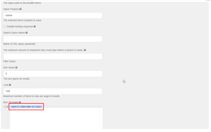
In the Data tab of the Select component dialog, add URL of the web service to be used. Following, define the value property and the item template. In the screenshot below these were set as "name" and "<span>{{ item.name }}</span>" respectively.
Other Advanced Features
Dependent Lookup
Follow these steps to create a dependent lookup:
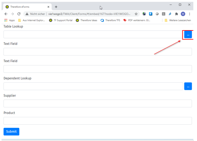
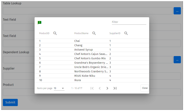
The objective is to have a second lookup that will show only the item filtered by the previous lookup.
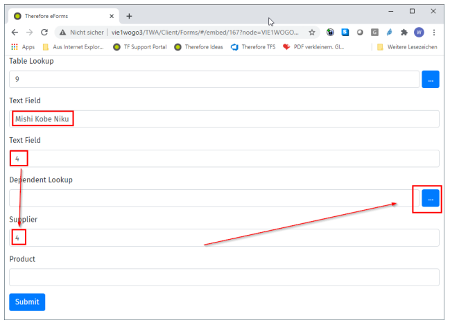
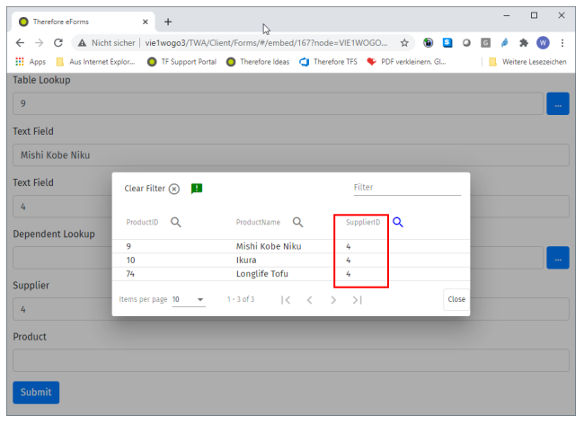
This shows that only items related to supplier #4 are available.
This was done with a logic on the “Supplier” Text Field:
Using script to Hide/Disable
Use this script to hide/disable any field in your eForm, including hidden fields.
form.components.find(c => c.component.key === 'select2').component.disabled = true;
form.components.find(c => c.component.key === 'dateTime2').component.disabled = true;
form.redraw();
'form.redraw()' is not always required, depending on the usage scenario.
Hide field on Multiple Conditions
If a field needs to be hidden with multiple triggers use Logic.
Set the actions to the following settings:
-
Action Name
Hide -
Type
Property -
Component Property
Disabled -
Set State
True
Wizard eForm: Carry Data Between Pages
Use this method to carry a value from one page to another in a wizard-type eForm.
On page 1 of the eForm, there is a table lookup (User Number) with 2 related data (Data 1 and Data 2).
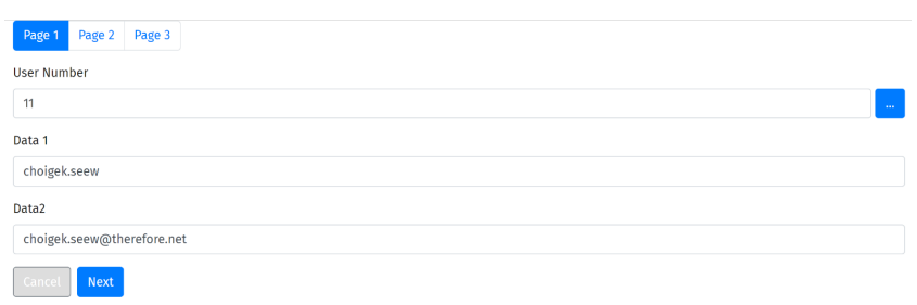
On page 2 of the eForm, there is a field that needs to contain one of the related data (Data 2). Use Javascript as shown in the screenshot below.
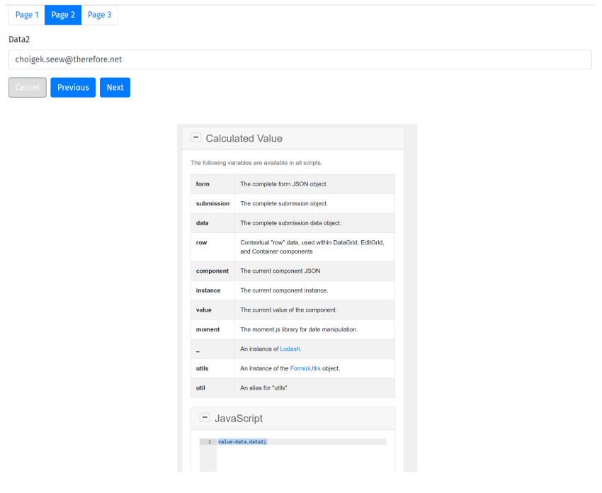
"value=data.data2;"
On page 3 of the eForm there are all three fields.
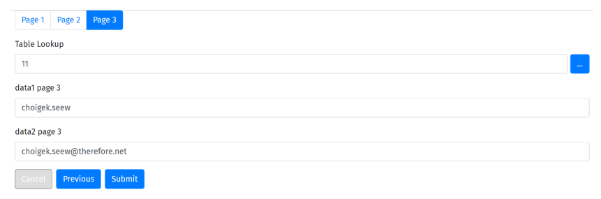
Use Javascript as shown in the screenshot below. The same concept applies to both the lookup field and data field.
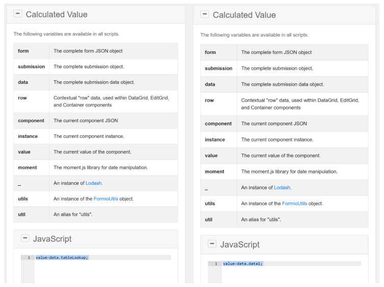
"value=data.tableLookup;"
"value=data.data1;"
All fields can be hidden or visible and will still work properly.
eForms Service
Using the internal service called eForms service the following functions can be accessed:
| Function | Description |
|---|---|
| getLoginInfo: () |
Returns LoginInfo. Depending on the usage, LoginInfo can also be found under LocalStorage or SessionStorage. |
| getInfrastructureInfo: () |
Returns InfrastructureInfo. InfrastructureInfo can be found under LocalStorage. |
| getUserInfo: () | Returns UserInfo. Currently, this is the only way to retrieve UserInfo since it does not exist under LocalStorage or SessionStorage. |
| getFieldTypes: () | Returns the internal Therefore™ eForms field types. |
Usage Example
The following example shows how to retrieve UserInfo using a script:
const userInfo = window.$eFormService.getUserInfo();
console.log('userInfo: ', userInfo);